Creative Direction + Design
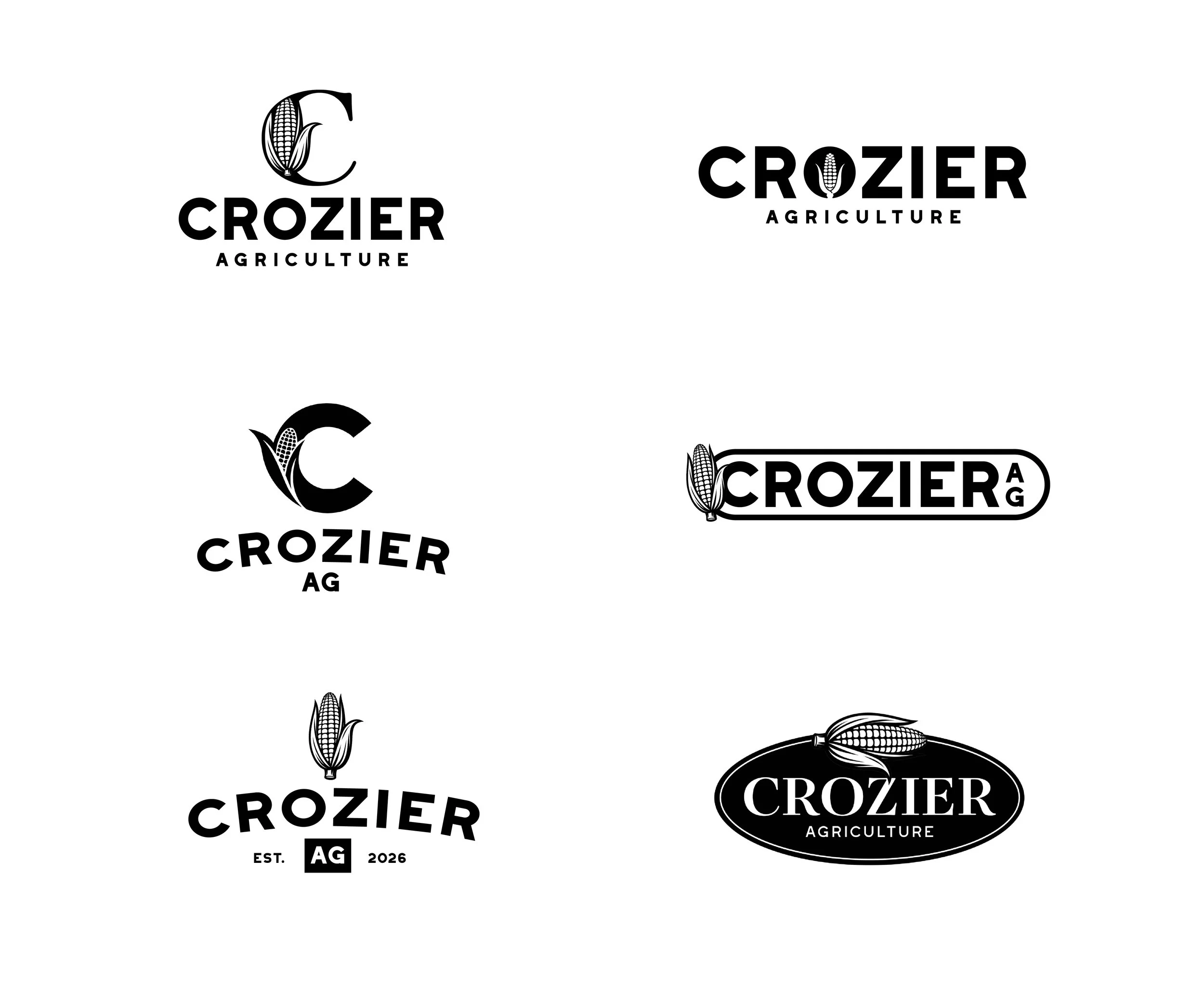
Crozier Ag is run by my cousin out of Southern Iowa. He sells seed and farms cattle / row crops. He reached out to me for a logo refresh, and asked for the following: easy to read/scale, incorporate corn and emphasize Crozier. Easy enough! I did some inspirational research on my end, and presented a few initial concepts (below) that blended his key components.
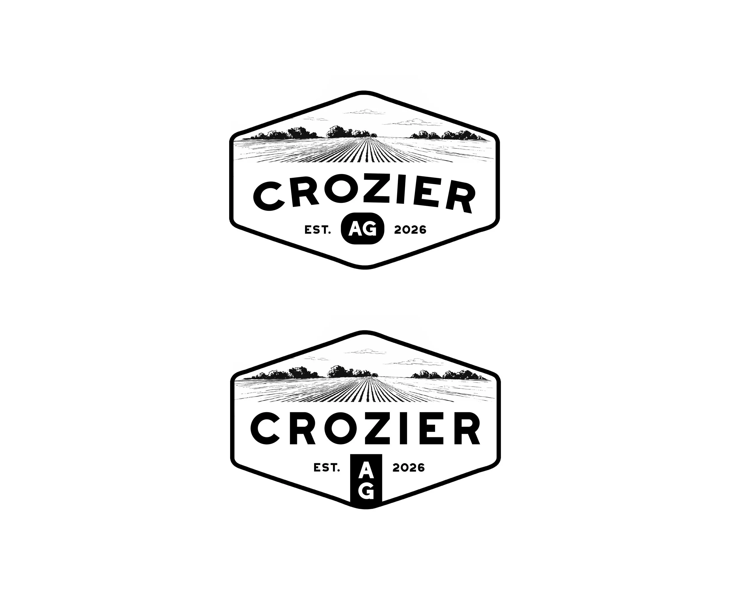
After discussing the first round drafts, he liked the idea of the logo living within a shape. It felt more whole and final in his opinion. He sent me a couple shapes he liked and I worked from there. He also wanted to see what adding a generic field illustration could do to fill space. Below are a couple of round 2 iterations with his requests.
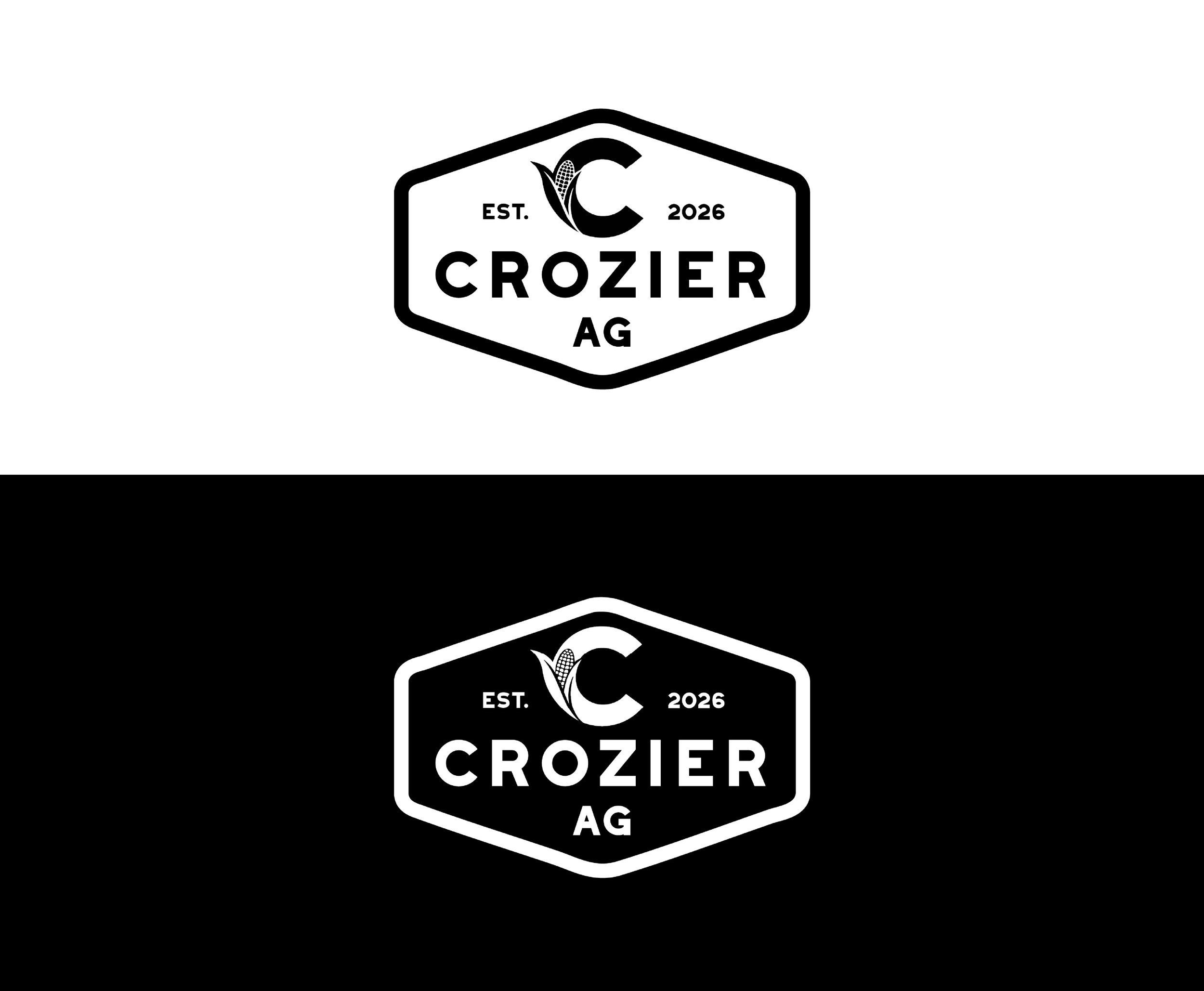
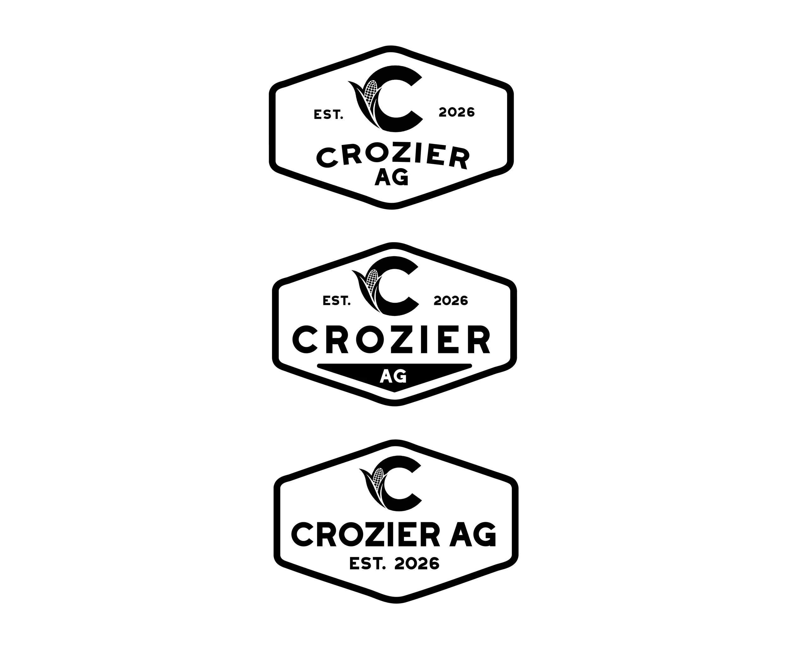
At this point, it was getting close, but not quite there. He wanted to scrap the field illustration after we decided it wouldn’t scale well, and he wanted to add the C with corn back in. This was a smart move in my opinion, as the C could be used as a stand alone mark as well. I sent him the below round 3 logos to react to.
He liked the second option, but asked for it without he triangular shape behind AG. Below is the final logo mark that he has started using for newsletters, mailers etc. and is going to soon start printing them on apparel. I’m looking forward to seeing how the logo can evolve his marketing material!